

About 1-1.5 hours before kick-off we receive info about starting lineups from different trusted sources. It is not rumours and not guesswork. Football fans want to know who plays and who sits out; bettors need to know about rotation as early as possible; analysts use lineups to think through tactics and substitutions.
When you visit our page you see the list of matches we already have starting lineups for. The list refreshes itself, without reloading the page. Above the table there is a counter «Total starting lineups for today», and the speaker icon on the right switches the sound alert for every new lineup on and off.
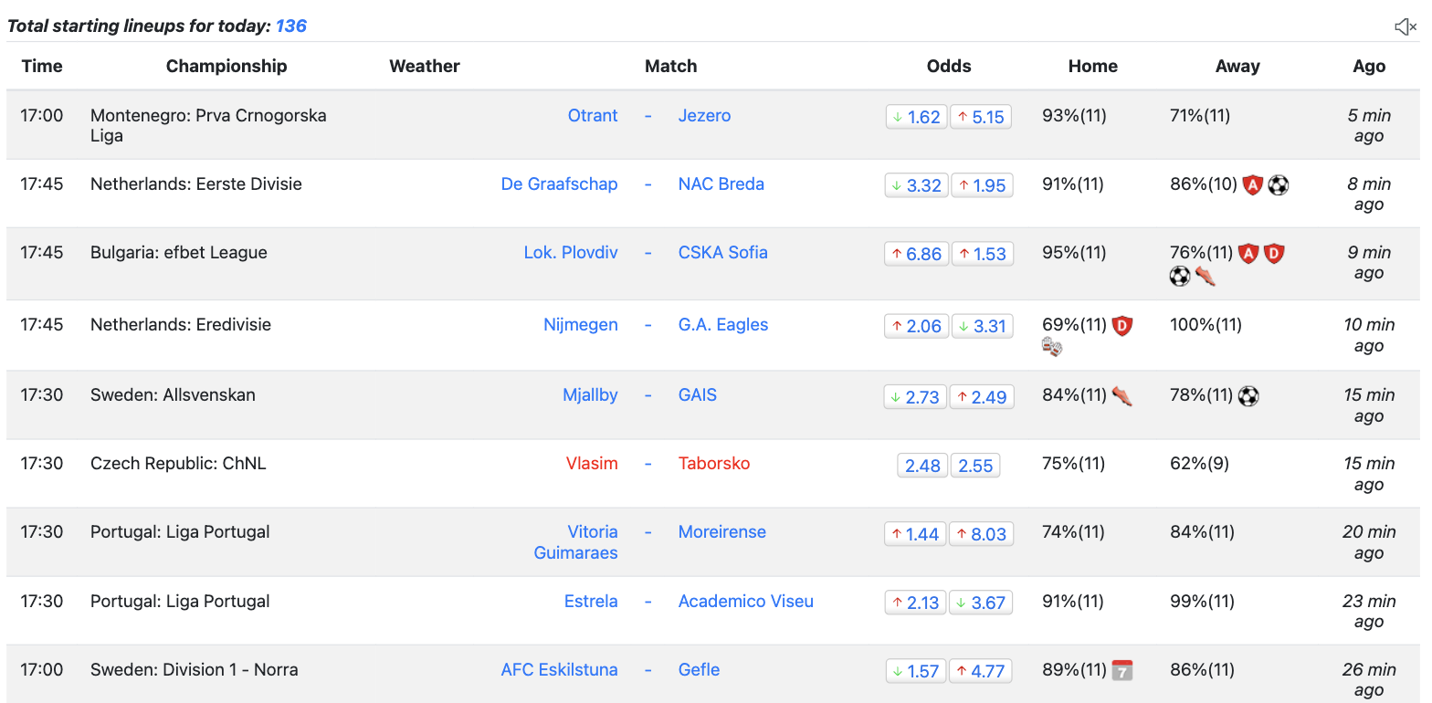
Columns from left to right:
The “perfect lineup” is the 11 players of the team with the most minutes on the pitch this season. If all of them start, the figure is 100%.
Note that we give info about English Premier League and Russian Premier League for free, as well as every match without rotation. The percentage of the perfect lineup is calculated on the Profi plan; on other plans you see ???% instead, except for free matches.
There are a lot of matches (up to 200 at the same time) during weekends and for faster navigation we give you special hints next to the lineup percentage. Hover any icon to see what it means.
 - attacking potential of the team is noticeably reduced
 - team is missing three or more regular defenders (based on minutes each defender played this season)
 - team is missing player with most assists
 - team is missing top-scorer
 - team is missing regular keeper (based on minutes each keeper played this season)
 - team is facing hectic schedule (it is a 3rd game in past 7 days)
 - team changed head coach recently
 - team is missing most expensive player (according to transfermarkt)
Clicking a team name in the list opens the quick preview window with both lineups. This click is what spends one view from your package; opening the same match again is free.
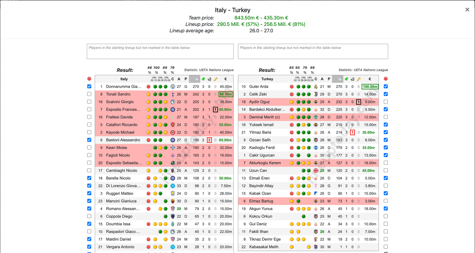
Coaches usually use 14-16 players while the others just make numbers and are not used often. That is why we sort all players by the number of minutes they played — the most used ones on top.
The window header shows three lines for each team: Team price — the Transfermarkt market value of the whole squad, Lineup price — the value of the announced starting lineup and its share of the eleven most expensive players of the team in percent, and Lineup average age. The Result: row gives the percentage of the perfect lineup for this match and for the three previous matches of the team. Next to it you can see which competition the player statistics are taken from (Statistic:).
Sometimes players use nicknames in the squad list, so our system cannot match them automatically. Such players appear in the box under the team name — tick the checkbox next to the player to add him yourself, and the percentage of the perfect lineup will be recalculated. The counter under the checkboxes shows how many players are currently marked as starting.
Columns from left to right: shirt number; name (the captain is marked with (c), and icons for injury, cards or suspension may follow); the dot of the current lineup; three dots for the previous matches; C — country; A — age; P — position (A – striker, M – midfielder, D – defender, G – goalkeeper); then minutes played, appearances, goals and assists. When the data is available, the table also shows € (transfermarkt market value) and R — the FotMob rating. The coach is named under the table; if he took over recently, his name is green.
The € column highlights the most expensive players of the team: the top value is shown green in a frame, the next two values green without a frame. That makes it easy to see whether the key players by value made the starting lineup or stayed in the pink rows.
Red dots mean the starting lineup for the current match, yellow dots mean bench players. Green dots in the three right-hand columns mean the player started previous matches, yellow ones mean he was on the bench. The header of each of those columns holds the abbreviation of the competition and the date of the match. Rows highlighted in pink are players who started the previous match but did not make this lineup — that is the rotation.
You can identify a player's exact position on the pitch by hovering over his name.
The screenshot shows the UEFA Nations League match Italy - Turkey of 5 October 2026. The lineups arrived 74 minutes before kick-off: only 48%(11) for the hosts against 85%(11) for the visitors. Nine Italy players are in pink — Tonali, Scalvini, Esposito, Frattesi, Calafiori, Kayode, Kean, Fagioli and Esposito S. — and four for Turkey: Aydin, Demiral, Akturkoglu and Elmaz. That is the rotation against the previous match, and for Italy it is drastic. The squads are worth 843.50m € against 435.30m €, but Italy started only 57% of its value and Turkey 81%: the most expensive Italian, Tonali (80.00m), stayed in a pink row, while the most expensive Turk, Guler (100.00m), was in the starting eleven. Over the same period the odds moved from 1.60 to 1.45 on the hosts and from 4.86 to 7.40 on the visitors.
From the archive you open the full match page — it is laid out differently from the quick preview window. Below is the LaLiga Madrid derby Atl. Madrid - Real Madrid of 8 January 2026.
A legend above the lineups explains every dot and every player status icon.

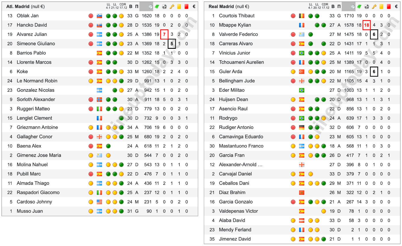
Here you can compare both teams at a glance and estimate how much the coaches have rotated. Apart from the red and yellow dots of the current lineup, the match page has two more: a black one means the player is in the extended squad, a blue one means he is in the possible XI. They appear before the official lineup is published and let you start the analysis earlier.
Columns from left to right: shirt number; name; status icon (injury, red card, suspension for yellow cards, in question, returning after injury or suspension); the second icon — captain or key player; the dots of the extended squad, the possible XI and the current lineup; flag; three previous matches with the competition abbreviation and date in the header (the bar under the header is green for a win, red for a defeat, orange for a draw); В — age; П — position; minutes played; appearances; goals; assists; yellow and red cards; market value in euros. The top scorer, the top assist maker and the most expensive player of the team are boxed.
Each team name is a link to its X (former Twitter) account, as most of the clubs publish lineups there first. Usually we publish our analysis 5-10 minutes after the official release, sometimes faster. Next to the name you can see the total market value of the squad in euros — it makes clear who is the favourite and who is the underdog on paper, especially in cup games.
The odds block sits under the lineups. The Current Odds table collects the lines of several bookmakers for the outcome (Home / Draw / Away) and for the 2.5 goals total (Over / Under), plus the margin on each market — Marg 1X2 and Marg O/U. The lower the margin, the fairer the line.

The UDI row under the Pinnacle line shows how much the price has moved since the line opened: green means the odds have shortened (money is coming for that outcome), red means they have drifted. The charts on both sides show the whole history of the Pinnacle and Bet365 lines for the selected market; use the arrows above a chart to switch markets.
In the Atl. Madrid - Real Madrid derby of 8 January 2026 the lineups came out 88%(11) against 81%(11): both teams were close to their strongest, but the icon fired for the visitors — reduced attacking potential. The line at kick-off was 3.23 - 3.70 - 2.22, with over 2.5 goals at 1.62. The match finished 1-2.